Social Media Cover Sizes 101
What’s the first thing people see when they visit your Facebook, LinkedIn, Google+, YouTube or Twitter page? That large photo at the top of the screen. Most social media platforms now have their own version of a cover photo, an image to showcase your personality, interests or business. With these images taking up more real estate on your page, you want to make they count! So, whether you want a stand-alone photo of your latest get together or carefully laid out content that highlights your business, you want it to catch your audience’s attention (in the good way).
Some social media platforms are more difficult to design covers for than others. Many are designed to accommodate the various screen sizes and resolutions that are now prolific in our high-tech world. However, this can pose challenges for designers. But don’t worry. I’ve worked out all the kinks for you and included easy to use templates for download.
FREE TEMPLATES:
Get your free Illustrator template download by clicking here.
Get your free Photoshop template download by clicking here.
Note: all units are in pixels
Your document size for a Twitter cover photo needs to be 1500 x 500. Unfortunately, you don’t get free reign of this entire space. Your content safe area is 1300 x 340. To accommodate your image even more for mobile users, decrease the width of the content safe area to 1020 pixels. Just keep in mind how this will affect the look of your cover photo on larger devices.
Similar to Facebook’s cover photos, a portion is covered on the left by your profile picture (240 x 240). There are 100 pixels between your profile picture and the edge of your image. I don’t recommend placing any important content here, as the profile picture will move side to side to accommodate various screen sizes. The template includes margins of 100 pixels on either side of the image so your cover photo looks balanced. Remember, that these margins are only to guide where your content goes. Be sure not to leave this area blank, as it will be visible when loaded.
Although you don’t actually lose any space on the sides of your cover photo, you do loose some in the height. The menu bar on top and your personal twitter information on the bottom account for a total of 140 pixels that are not visible (70 pixels on top and bottom).
YouTube
This was a difficult cover photo, also referred to as “channel art”, to figure out because the dimensions not only accommodate desktop monitors, tablets and smart phones, but also televisions.
The size of your document needs to be 2048 x 1152. The content safe area, measuring 1235 x 336, accommodates small desktop screens and mobile users. There are 405 pixels to the left and right of this area that will be visible on tablets and larger monitors.
The recommended upload size for your profile picture is 800 x 800, which appears to the left of the content safe area on your cover photo. If your YouTube channel is merged with your Google+ account, the profile picture will be generated from Google+ automatically.
You may have read about larger recommended dimensions than those I have given. Those dimensions are created to accommodate retina displays. If you know that your audience is likely to be using this type of screen, gamers or web designers for example, you can easily use the template provided as a starting point. The proportions are approximately the same, so simply select all layers and enlarge them to the new document size (2560 x 1440).
Facebook has not enabled the cover photo to be a responsive as other platforms. However, this makes the process much more user friendly from a designer’s point of view.
There are still a couple of parameters you need to keep in mind. First, your profile picture (160 x 160), name and title, and “like”, “follow” and “share” buttons sit on top of your cover photo. Your name and title will cover more or less of your image depending on its length. Also, if you are looking to accommodate mobile users, your content safe area will decrease by 144 pixels to the left and right of your image.
What you need to pay attention to with this platform is what type of page you are designing your cover for, personal or business. The dimensions of each are slightly different. I will be covering the business version below. Keep in mind that LinkedIn cover photos are not visible on mobile.
Cover Photo: 646 x 220
Profile picture: 100 x 60
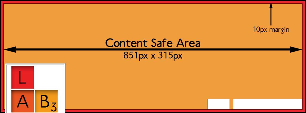
In this case, that’s all there is to it. I just recommend leaving at least a 10 pixel margin around the border so your content does not crowd the edges of your image.
Google+
This platform has bypassed all the responsive design and overlapping content to provide a simple, clean, space to show off your cover photo.
Cover: 1080 x 608 (recommended)
Profile: 270 x 270 (displayed as circle)
Again, I recommend leaving at least a 10 pixel margin at the edges for content.
Good luck with your cover photos and make your social media platforms stand out from the crowd!
FREE TEMPLATES:
Get your free Illustrator template download by clicking here.
Get your free Photoshop template download by clicking here.
Sources
http://www.jennstrends.com/format-new-twitter-header-image-2014/
https://support.google.com/youtube/answer/2972003?hl=en
https://www.facebook.com/PagesSizesDimensions
http://www.thesocialmediahat.com/article/complete-social-media-cover-photo-guide


